
Dra Marcelle Winik Identidade Visual
PT.
POSICIONAMENTO
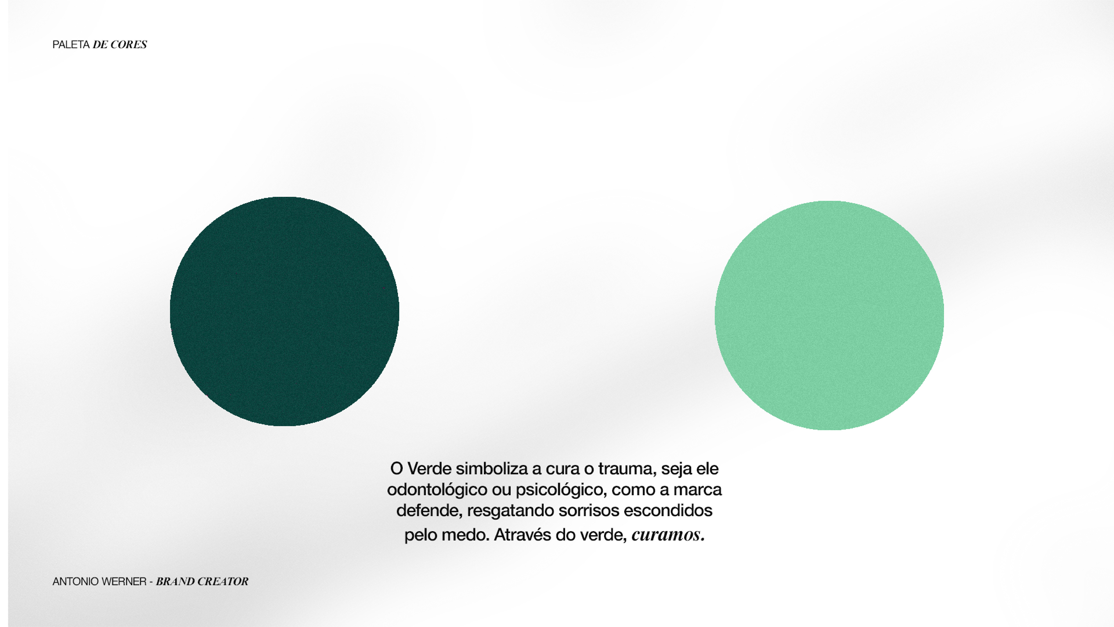
A Dra Marcelle Winik é uma Cirurgiã Dentista focada em resgatar sorrisos e ressignificar traumas de dentistas.
A Dra Marcelle Winik é uma Cirurgiã Dentista focada em resgatar sorrisos e ressignificar traumas de dentistas.
Declaração de Posicionamento
Quero resgatar sorrisos perdidos, de
pessoas que até esqueceram de como sorrir,
por alguma questão d e natureza estética ou
por traumas da visita regular ao dentista.
Através de uma experiência colaboradora,
humana e cautelosa, ofereço antes de
mais nada, o cuidado.
Busco ressignificar os medos e trazer de
volta a autoestima de cada paciente, de
forma individual, confidente e detalhista.
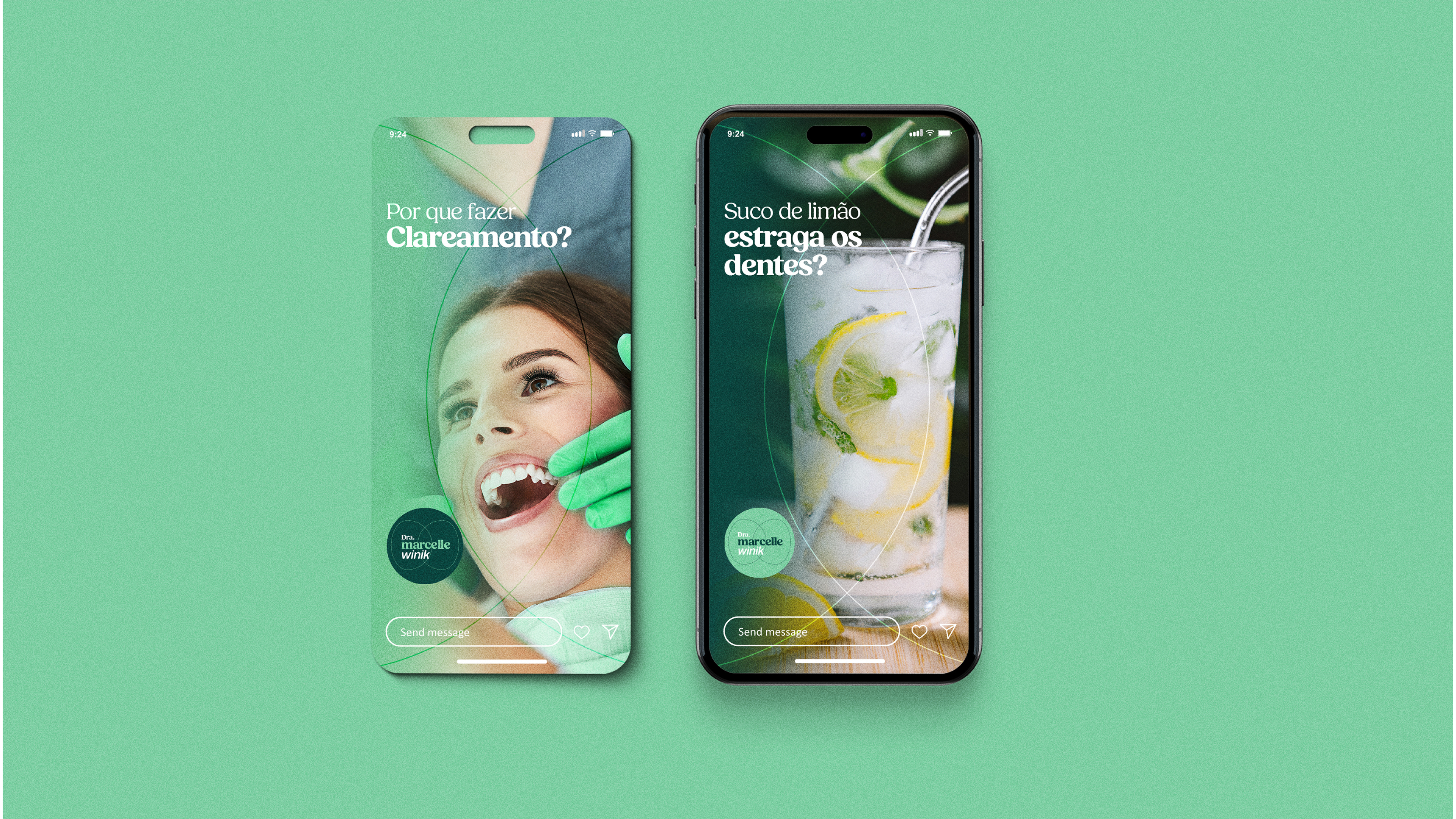
Meus serviços englobam limpeza e
prevenção, branqueamento, tratamento de
canal e DTM.
pessoas que até esqueceram de como sorrir,
por alguma questão d e natureza estética ou
por traumas da visita regular ao dentista.
Através de uma experiência colaboradora,
humana e cautelosa, ofereço antes de
mais nada, o cuidado.
Busco ressignificar os medos e trazer de
volta a autoestima de cada paciente, de
forma individual, confidente e detalhista.
Meus serviços englobam limpeza e
prevenção, branqueamento, tratamento de
canal e DTM.
—
DESIGN
A tipografia foi pensada para transmitir o arquétipo do Cuidador/Prestativo, e também fugir do padrão dentro da Odontologia. Então optamos por uma fonte Humanista, com o sobrenome em fonte Sans customizada e em itálico.
SÍMBOLO
O símbolo foi criado a partir das iniciais M e W, e representa um dente, porém diferente do que é trazido comumente no segmento, é um dente visto de cima, e no centro dele, no "coração" do dente, fica o canal, uma das especialidades da Endodontia.
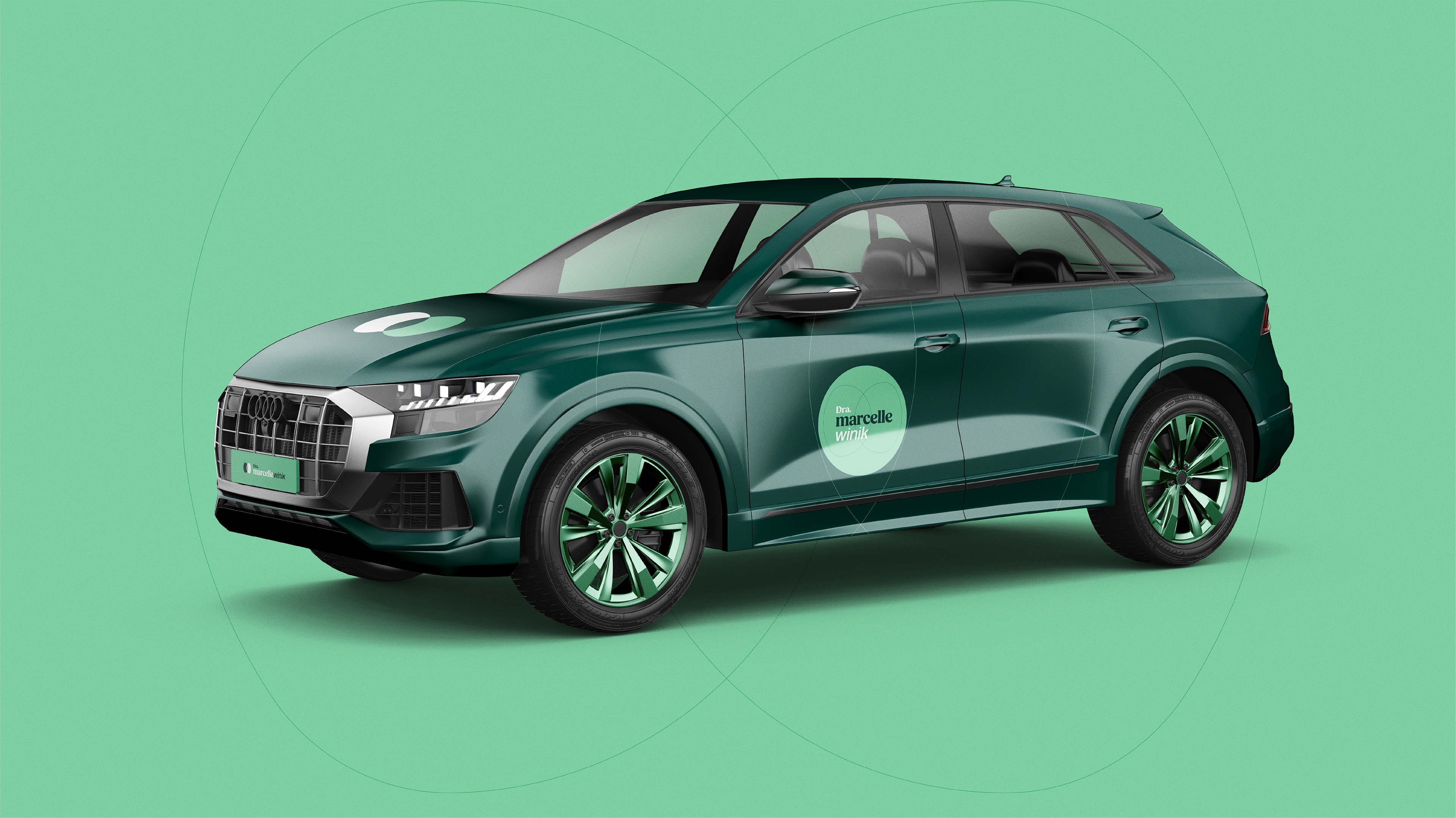
Cliente: Dra Marcelle Winik | País: Brasil | Ano: 2024 | Design e Branding: Antonio Werner
Marcelle Winik Brand Identity
EN.
POSITIONING
Dr. Marcelle Winik is a Dental Surgeon focused on restoring smiles and redefining traumas related to dental experiences.
Dr. Marcelle Winik is a Dental Surgeon focused on restoring smiles and redefining traumas related to dental experiences.
POSITIONING STATEMENT
I want to restore lost smiles
of people who have even forgotten how to smile,
whether due to aesthetic issues
or traumas from regular dental visits.
Through a collaborative, human, and cautious experience,
I offer, above all, care.
I seek to reframe fears and bring back each patient's self-esteem
in an individual, confidential, and detail-oriented way.
My services include cleaning and prevention,
whitening, root canal treatment, and TMJ therapy.
—I want to restore lost smiles
of people who have even forgotten how to smile,
whether due to aesthetic issues
or traumas from regular dental visits.
Through a collaborative, human, and cautious experience,
I offer, above all, care.
I seek to reframe fears and bring back each patient's self-esteem
in an individual, confidential, and detail-oriented way.
My services include cleaning and prevention,
whitening, root canal treatment, and TMJ therapy.
DESIGN
The typography was designed to convey the archetype of the Caregiver/Supporter, while also breaking away from the typical patterns in Dentistry. We chose a Humanist font, with the last name in a custom Sans typeface in italics.
The typography was designed to convey the archetype of the Caregiver/Supporter, while also breaking away from the typical patterns in Dentistry. We chose a Humanist font, with the last name in a custom Sans typeface in italics.
SYMBOL
The symbol was created from the initials M and W and represents a tooth, but unlike the usual representations in the field, this is a top view of a tooth. At its center, in the “heart” of the tooth, lies the canal, one of the key areas of Endodontics.
The symbol was created from the initials M and W and represents a tooth, but unlike the usual representations in the field, this is a top view of a tooth. At its center, in the “heart” of the tooth, lies the canal, one of the key areas of Endodontics.
Client: Dra Marcelle Winik | Country: Brazil | Year: 2024 | Design and Branding: Antonio Werner