Vozco™ Naming + Identidade Visual
PT.
POSICIONAMENTO
A Vozco é uma Consultoria Estratégica de negócios, que opera a partir da gestão de tráfego e comunicação.
NAMING
Vivemos na era da experiência. Nos tempos atuais, apesar de estarmos inseridos em um momento onde devemos encantar e fazer o cliente se sentir acolhido com uma experiência única, empresas abusam da inteligência artificial, buscando automatizar relações e otimizar tempo. É exatamente aí que a marca entra, pois a única coisa que não pode ser otimizada e automatizada, é a conexão humana. Somos seres humanos e o que nos torna único é a inteligência emocional.
Aquela frase “Pessoas se conectam com pessoas” é um fato, a inteligência artificial não consegue criar conexão genuína. Os projetos acontecem entre pessoas, entre nós, conVOSCO.
Assim, busquei a etimologia da palavra convosco, e ela vem do latim, “junto de vós”. Como dito no briefing e nas conversas, seremos os sobreviventes sólidos da inteligência artificial, pois somos capazes de criar conexão, e seremos parceiros do cliente durante toda a jornada, “junto de vós” estaremos.
E aí, nasce uma palavra nova, com uma sonoridade original e com personalidade. Carregando exclusividade, força e seriedade para a marca.
VISUAL EXPRESSION
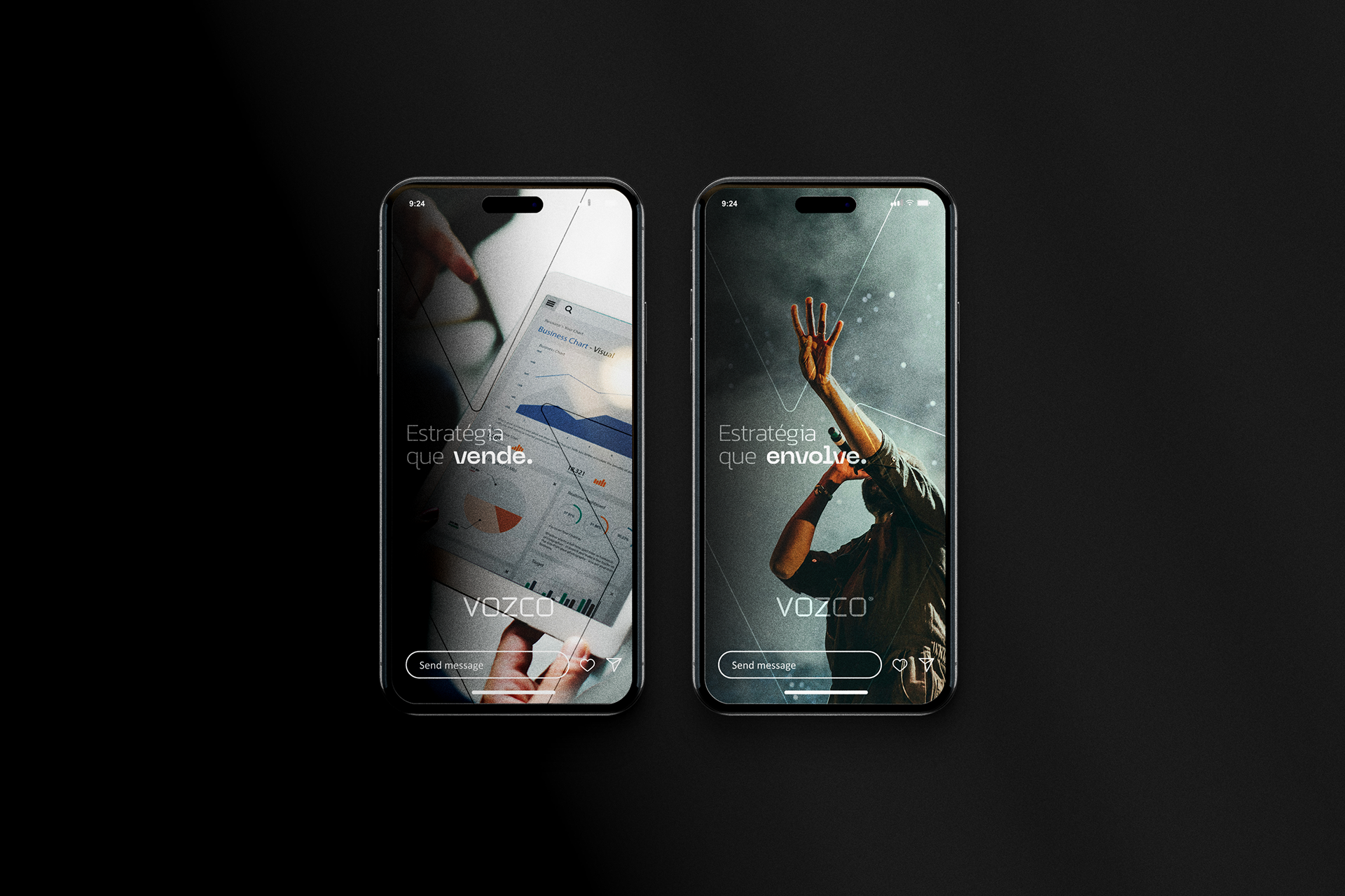
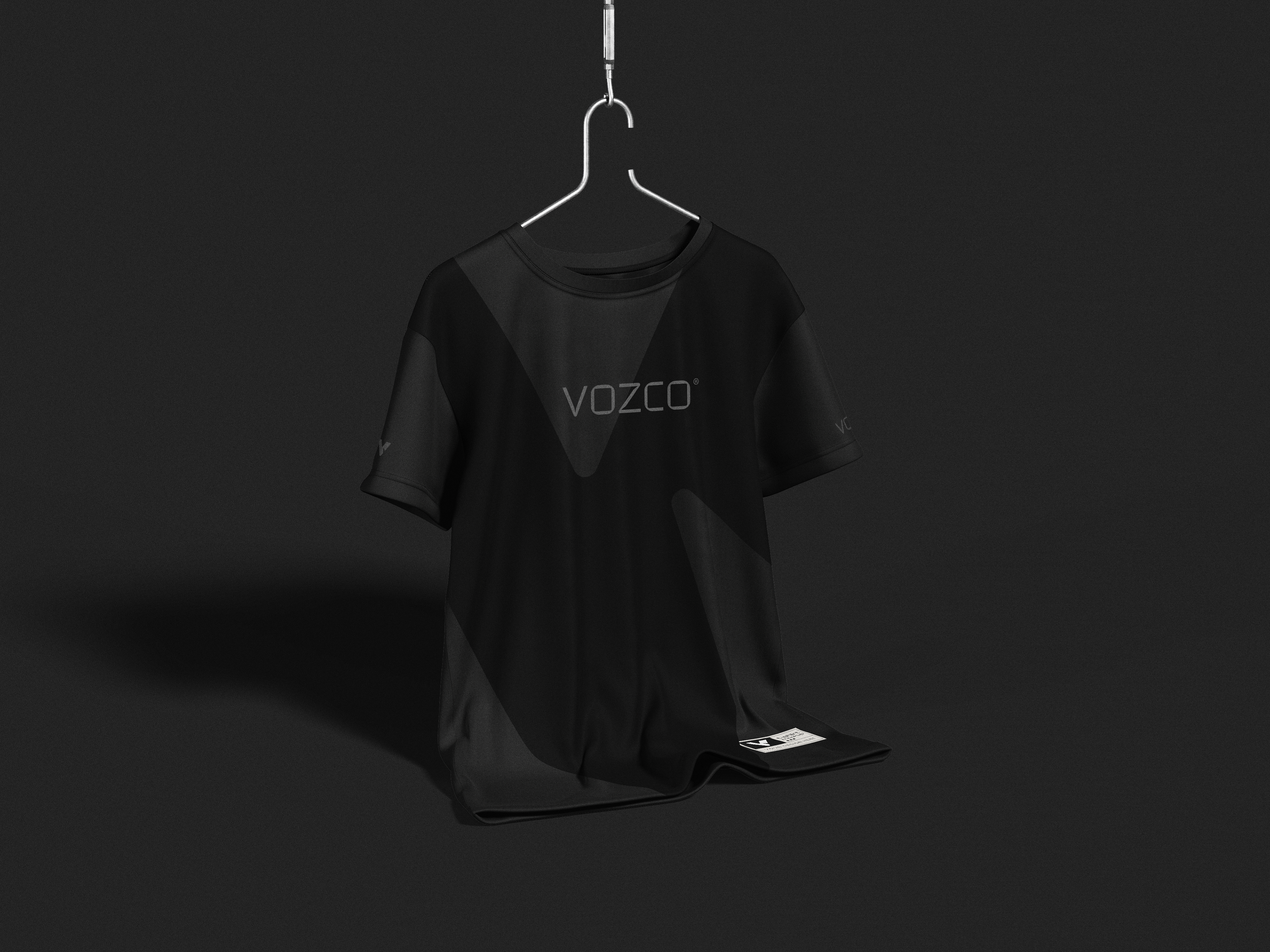
For the visual scenarios, we employed motifs of drive, sobriety, and a strictly monochromatic palette. From the outset, the Hero archetype was overwhelmingly present, so these visual scenes made perfect sense.
For the visual scenarios, we employed motifs of drive, sobriety, and a strictly monochromatic palette. From the outset, the Hero archetype was overwhelmingly present, so these visual scenes made perfect sense.
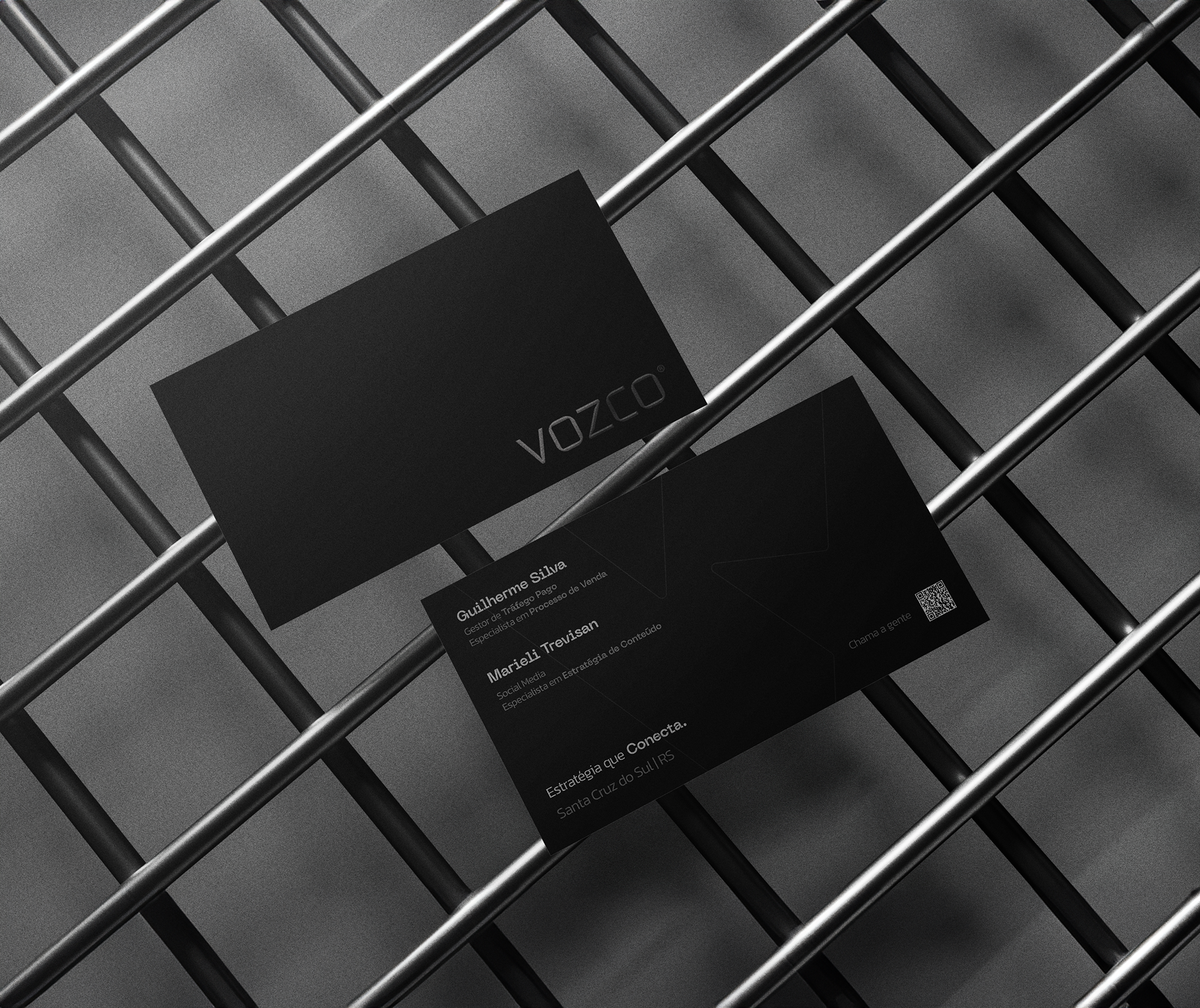
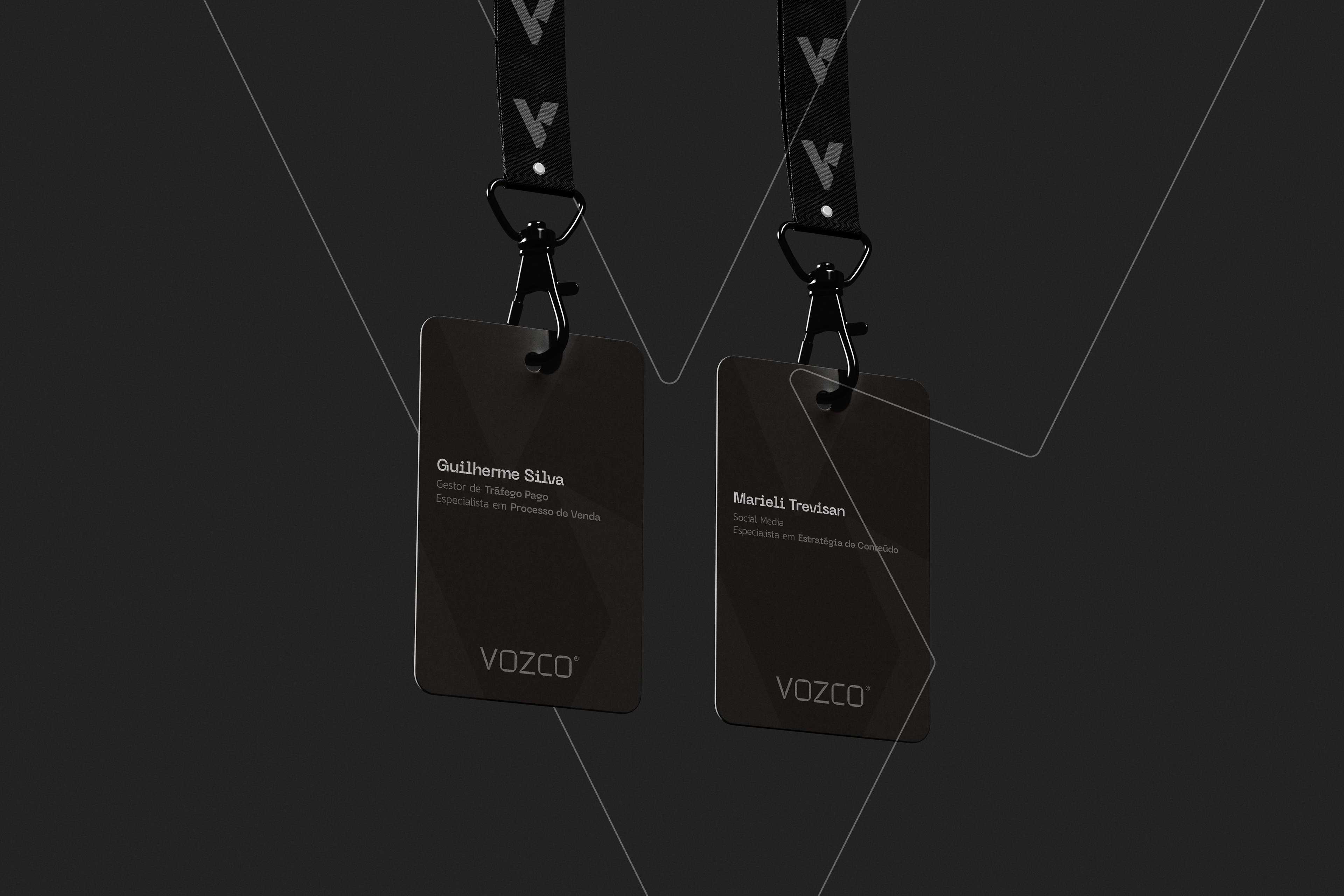
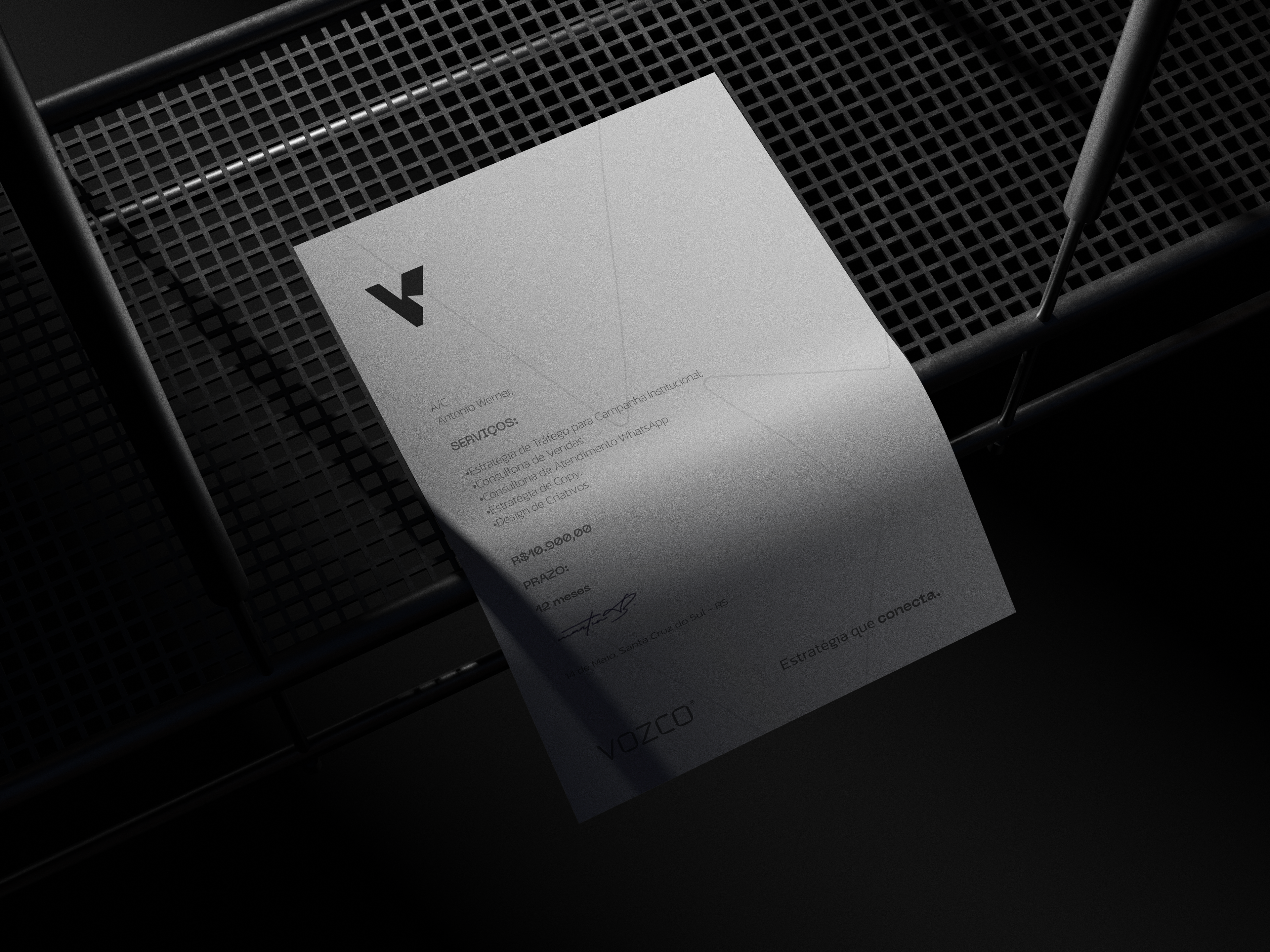
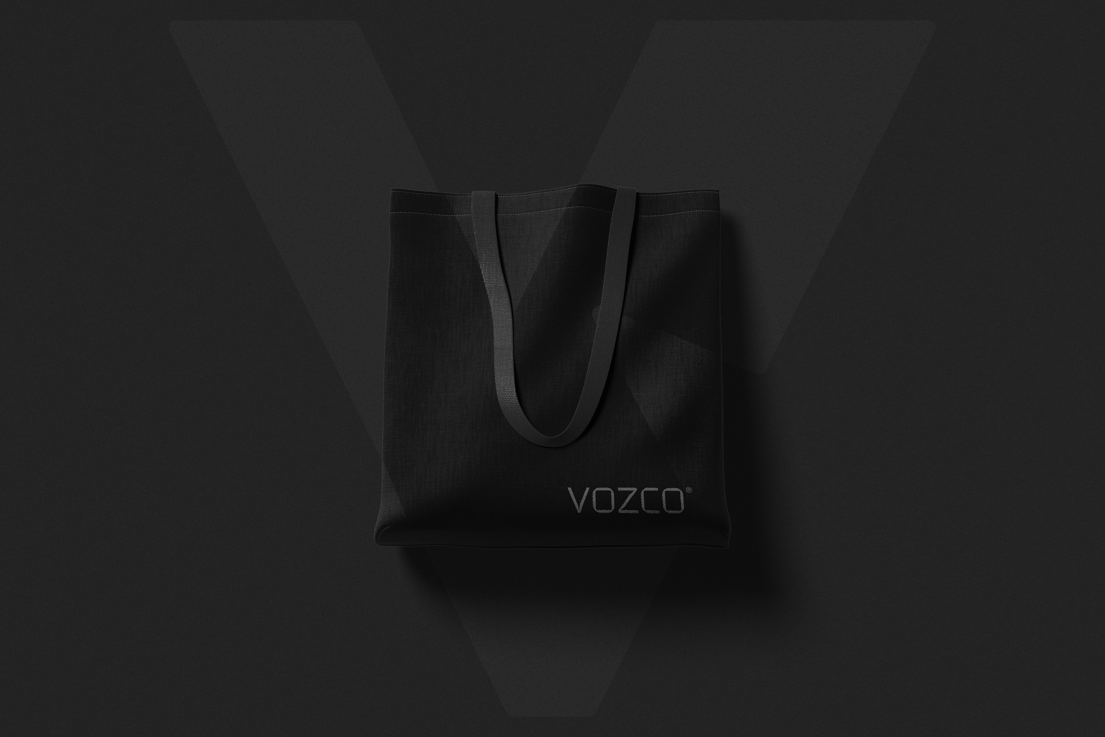
To break away from typical digital trends—where vibrant hues are often overused—we opted for shades of gray. This not only reinforces the weight of the name but also makes physical production of brand materials simpler and more distinctive.
The typeface was heavily customized with bespoke joints and cuts. The standalone symbol, designed to function separately from the logotype, was conceived as the primary signature element in the brand’s communications.
—
Cliente: Vozco | País: Brasil | Ano: 2024 | Design e Branding: Antonio Werner | Naming: Antonio Werner
Vozco™ Naming + Brand Identity
EN.
BRAND POSITIONING
Vozco is a Strategic Business Consultancy that operates through traffic management and communication.
NAMING
We live in the age of experience. Today, even though we’re in a moment where businesses must delight customers and make them feel welcomed through a unique experience, many lean too heavily on artificial intelligence—automating relationships and chasing efficiency. That’s precisely where branding steps in, because the one thing that cannot be optimized or automated is human connection. We are human beings, and what makes us unique is our emotional intelligence.
That saying, “People connect with people,” is true: AI cannot forge genuine bonds. Real projects happen between people—between you and me, conVOSCO.
So I looked up the etymology of “convosco,” which comes from the Latin con vōs, meaning “together with you.” As we discussed in the briefing and follow-up calls, we will be the true survivors in an AI-driven world—because we can build real connection, and we will stand by our clients every step of the way: “together with you.”
And from that insight, a brand-new word was born—fresh in sound, rich in personality, carrying exclusivity, strength, and gravitas for the brand.
SYMBOL
The symbol was inspired by the concept of healing, with light energies being emitted.
—
—
Client: Vozco | Country: Brazil | Year: 2024 | Design and Branding: Antonio Werner | Naming: Antonio Werner